Okay, so full transparency here: I am starting this from a complete beginner’s mind, both by choice and circumstance. As a first-time wireframe dabbler, I welcome you to join me in exploring what this has to offer from a noob perspective. So, if you too are unfamiliar and looking for wisdom and advanced insight on how to utilize this tool, you’re in good company!
In this article:
- What is a Wireframe?
- What Good are Wireframes?
- Getting Down to the Wire(frame)
- Messing Around with Google Drawings
- Pros & Cons of using G Drawing as a Wireframe
- My Super Professional Experience Conclusion: Meh
- Making Your Own Wireframe: Yea or Nay? ?
What is a Wireframe?
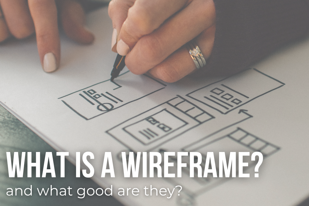
Thanks to the Google overlords, I can tell you: a wireframe is the drawing board and blueprint of a two-dimensional, skeletal outline of an app or web page. Wireframes can be drafted digitally or on paper, depending on the needs of the creators and product.
The purpose of wireframes is to craft a defined sundown of page format, layout, information construction, user flow, and expected behaviors. Wireframes generally are the sketch of a concept, so color palettes, brand style, and graphics aren’t a focus of this stage. Like a house, this blueprint is meant to hash out where all of the details go to ensure fluidity and function before building out the concept. From there, sharing the wireframe allows the team and stakeholders to make any adjustments necessary before implementation.
What Good are Wireframes?
According to CareerFoundry, wireframes: keep the concept user-focused, clarify and define website features, and are quick and cheap to make and use.
User focused
Wireframes can be used to prompt honest and early feedback from beta testers, give framework for conversations with stakeholders, be a platform for designers to brainstorm, and inform programmers how users would interact with the interface.
Clear features
As many of us know, the jargon can get a bit much when it comes to communicating with parties who aren’t familiar with tech lexicon. Wireframing allows a visual aid to communicate the features’ purpose and function, how the spacing and layout will look, and define places that are overcrowded with features or removable busyness.
Quick & cheap
While there are some really in depth Wireframe programs out there, like Sketch for intensive or aesthetic pixel-based canvases or Balsamiq for the more foundational layout, design, and basic architecture, they can also come cheap as free. Pen and paper wireframes can be useful, especially in the initial planning stages.
BACK TO TOP
Getting Down to the Wire(frame)
I first heard about wireframes from LASSO’s Head of Content, Jess Cook, on a LinkedIn post.
Below, I use Cook’s suggested method of taking something that I’ve already written and pasting it into a Google Drawing. The selected article: The DEI+B (R)Evolution: Workplace Edition. I am curious to see how this might look different.
BACK TO TOP
Messing Around with Google Drawings
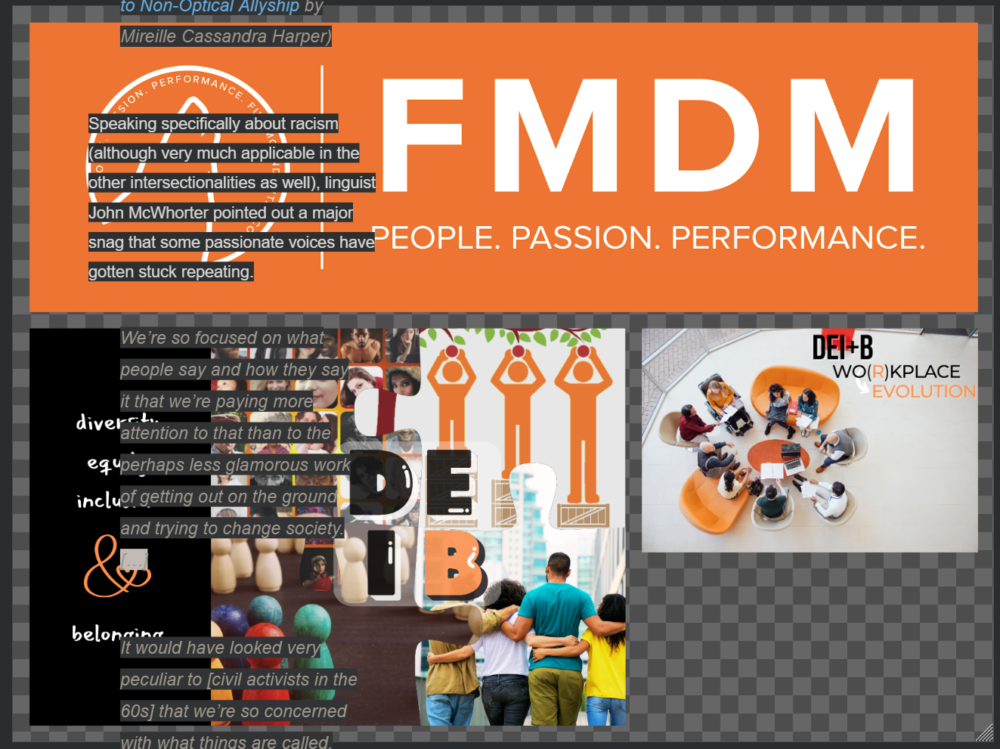
I opened the link above and copied the content–including imagery. It didn’t seem to make much sense, and the article scrolled up and down past the G Drawing space:
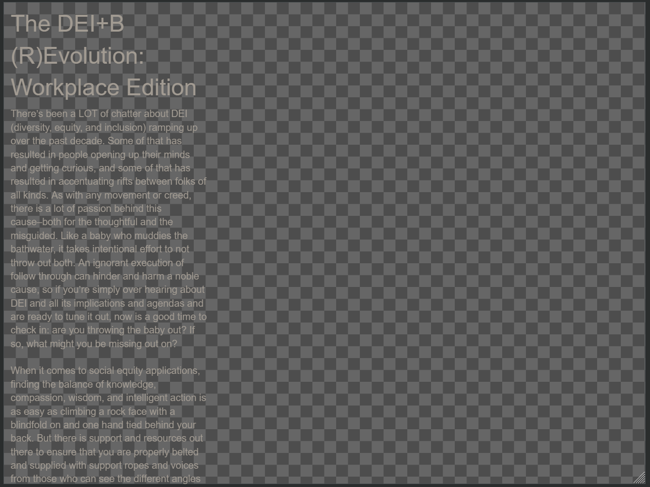
Looking at the directions again, she said to open a copy doc and transfer it over. I didn’t have images in my copy, but I did it anyway. This is how it looked:
Interesting… Where to go from here? I went digging into Cook’s post a little deeper and discovered an example she shared with another inquisitor in the comments. She used a wireframe to make a landing page for Marpipe, a creative content analyzing company that helps advertisers scale profits and create smart content. You can compare her wireframe below with the implemented product here:
Okay. So, it looks like a wireframe helps you take a step back and see a complete project if you expand the dimensions of your wire frame and move things around manually. I’m going back to the original paste I made with the DEI+B article, resizing the wireframe square, and rearranging the content.
Step 1
Resize the G Drawing wireframe
Click File ?? ?Page Setup ?? Custom. Since I didn’t know where to start but I knew I needed much more space, I tried out 15×30 which wasn’t quite right. Then I discovered when you hover the mouse on the bottom right corner of the wireframe, an indicator appears that you can click to resize your wireframe base manually.
⬆️
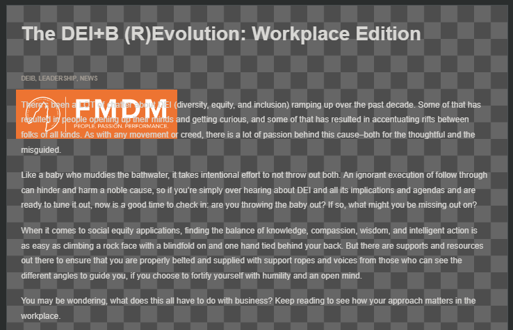
From there, I resized the textbox to fit what my browser sees in width as far as the text goes, ensuring that the size to the original blog post was comparable. I had to mess around with this after finding a workable wireframe size as the textbox was huge and no longer touching the base, and I ended up copying, cutting and pasting this once more, which placed the title at the top of the frame base once I made it 10×75 through Page Setup. I again had to adjust the text width, because it pasted without the format I had already established.
So, the text now matches that which shows up in my browser on the published blog:
Step 2
Rearrange the imagery to match current content
To the left, you’ll see the complete DEI+B article and images as a complete package from G Drawings.
To access the images that were lurking behind the text from the original paste into GD, I right-clicked the textbox and selected “Send to back.” I attempted to select an image to paste where I wanted it, but it seemed to only paste at a certain location on the wireframe base. I instead zoomed out to move the image from the top down to the bottom, where it originally shows in the blog.
The initial transfer didn’t keep the formatting, so I had to recreate space in the text for the images to land.
BACK TO TOP
Pros & Cons of using G Drawing as a Wireframe
Benefits:
- Easy to visualize the end results
- Great for projects with several independent elements
- Easily can spot where formatting revamp or image insertion can bring more balance to the overall look & feel
Disadvantages:
- Fickle and slightly glitchy
- Copy + Paste doesn’t translate some aspects of formatting
- Selecting images to move can jump you to a completely different image at a different spot on the frame
- For content-heavy blogs, it can be difficult to rearrange elements unless they are separated content
- Every time you resize the wireframe base, the content and images need readjustment
- Long-form text that isn’t separated becomes difficult to navigate
Generic Pros & Cons of Wireframes:
Pros
- Can save time/money in the long run
- Wireframes can give a holistic view of your content
- Gives a framework that can guide content provider work
- Acts as a visual aid to stakeholders unfamiliar with the design process
- Serves as a meeting place for all contributing departments of the project
Cons
- Tricky to change designs without investing in detail-oriented wireframing tools
- Time consuming, especially if using more basic wireframe platforms
- Limits design creativity to the wireframe’s capacity
- Adding wireframes is another step in the process
- It can limit the content able to be included
More wireframes to explore here: The 8 Best Wireframing Tools Every UX Designer Should Know
BACK TO TOP
My Super Professional Experience Conclusion: Meh
Having spent a large chunk of my education in English classes and writing extracurriculars, this kind of reminded me of writing an outline before actually diving into the paper itself. This never interested me, but I still tried it. And it was the only time I EVER got a D on an assignment which absolutely crushed me, having never gotten anything below a B+ in English subjects. ? (Yeah, I was one of those kids.)
I tend to work best by creating in a bit of a chaotic flow; when prepped and composed, my outlines rarely end up matching the result because I get different, better ideas that come to me along the way during the actual writing (aka the creative process). Maybe that’s my ADHD kicking in–the outline comes after the content is mass produced in the refining process. But hey, it works for me.
Personally, for long-form, I don’t see using a wireframe as necessary or very helpful, yet. While it is easy to see the layout and how things will look, using WordPress and simply utilizing their “preview” feature is the aid I need at this juncture. However, for brochures, interactive UX designs, or sleek scroll-throughs with short or concise sections, this ability to zoom out and arrange the view could benefit ‘verts and marketing pages to get a more global impression of your project. Or, perhaps, when we get our fully revamped Fullmoon website this summer (Stay tuned!! ? Such excite, much wow!), the new formatting will be a bit more conducive to using wireframes for blogging.
Making Your Own Wireframe: Yea or Nay? ?
There’s a lot to consider when considering implementing a wireframe, and there are resources to help from some pretty fantastic gurus. If you’re looking into how to most effectively start using this scaffolding, don’t fail to check out this definitive guide for making your first wireframe or watch this 12-minute video I found just for you:
Opinions vary on the value of wireframes and their contribution to productivity and design. Do you or those in your enterprise construct wireframes? If so, do you feel their benefits outweigh any disadvantages that have cropped up in their application? Let us know below!


