In the world of conversion rate optimization, there are a lot of improvements that can improve results.
Here are studies from our client work that had some results that made our clients smile.
How Videos Increased Revenue by 55% for BanksPower.com
Video content has been proven to increase engagement, so we stand to hypothesis that it should also translate that engagement into customer purchasers.
The Research
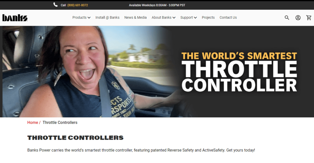
BanksPower.com has always used images in their collection pages. Their initial page was straightforward (basic) and had just a hero image, usually of a customer’s reaction.
The Execution
FMDM came up with the idea to test a video variation against the original static image hero banner.
We placed a video, product shot showing the size of the product in context of a customer’s hand.
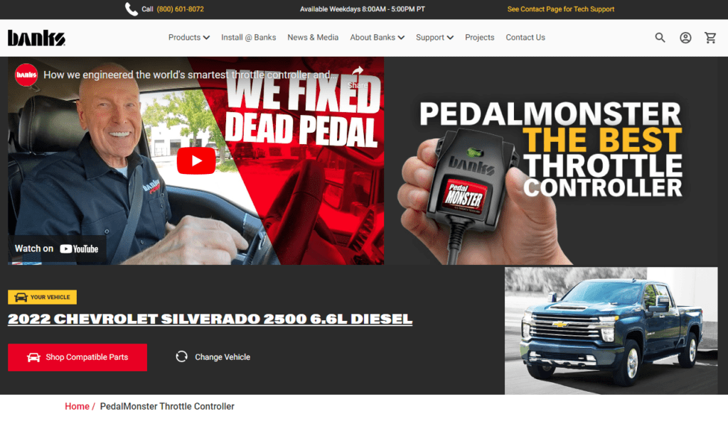
After testing the video design, we found that the video version outperformed the original version and increased product sales by over 55%! This was confirmed within our control campaign set up and hold out group.
This lift doubled our sales over the course of a 3 month test. Video is not part of asset mix and the client continues to invest in creating high quality videos for key product launches.
Why did this happen?
There are many reasons why we saw the amazing results, but here are FMDM’s likely reasons:
- BanksPower was already an established brand in the aftermarket performance industry and customers wanted to hear from the expert himself, Gale Banks.
- Most of their customers engagement with their organic YouTube videos. Here’s what Jay from BanksPower shared, “We now understand that our customers are highly engaged with videos that educate and inform; they want to know that what they’re buying will work for their vehicle.”
- 80% of customers are on mobile and consume videos content.
Another reason for this lift is that auto enthusiasts find the videos credible from an automotive industry expert.
CRO Expert advice
It all comes down to knowing what content your customers enjoy engaging with and what content influence their buying decisions.
Additionally, data has the power to validate hypothesis, intuition, and gut feeling. But at the end of the day, opinions does not matter, results do.
How LAGO improved customer funnel conversion rate by 34%
With Lagowear.com, it took us several iterations of the homepage, category collection page, and product page to see the lift in customer funnel conversion rate.
Sustainability is a great selling point for eco-conscious consumers, right? Maybe.
The research
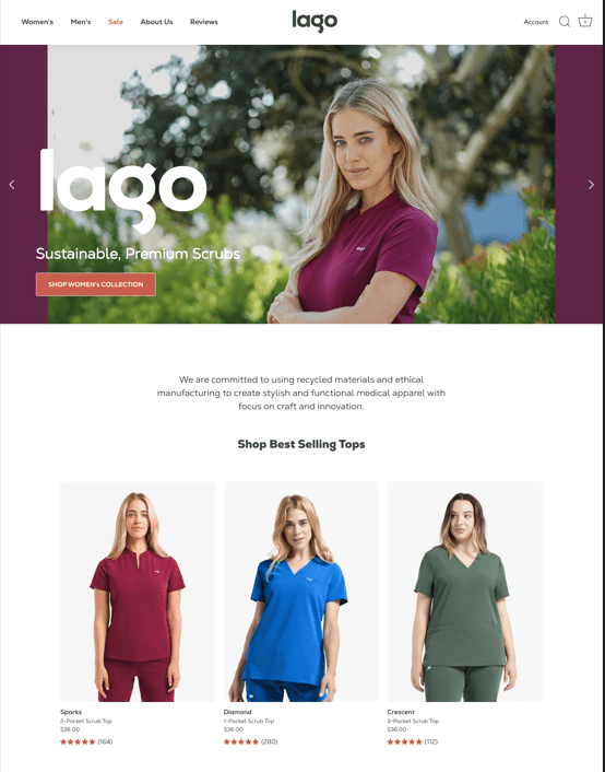
Lagowear.com is a eCommerce store selling medical scrub apparel made from recycled plastic bottles. They wanted to increase their sales once customers visit their homepage, so we turned to testing.
The execution
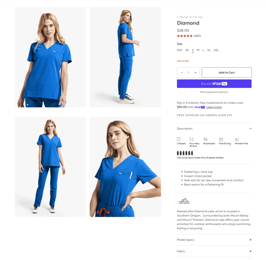
There was a lot to juggle for this client, so it was important to prioritize which pages to test. We tested the homepage by showcasing our collections. And we started working on the product page to add more important information for each sku, like color options.
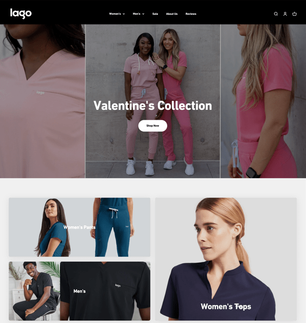
We tested new variations of the product page. Product page before.
This is the new product page with color swatches:
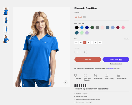
After testing, we got a increase of 34% in cart conversions, which led to 22% more products being sold than when we started.
CRO actionable advice
Testing is an iterative process, in this case took 4 months. We committed to improving the customer funnel so we stayed with minor adjustments along the way. This was a testing campaign, rather than a one-off sprint.
With each step of the way, we gained insights — what worked and what didn’t work — using what we observe to drive new tests.
Patience is key; it took us 4 months and over 10+ tests before we figure out that color options had the most impact with this audience.
How BuggyWhip improved Shopify cart conversion rate by 343.2%
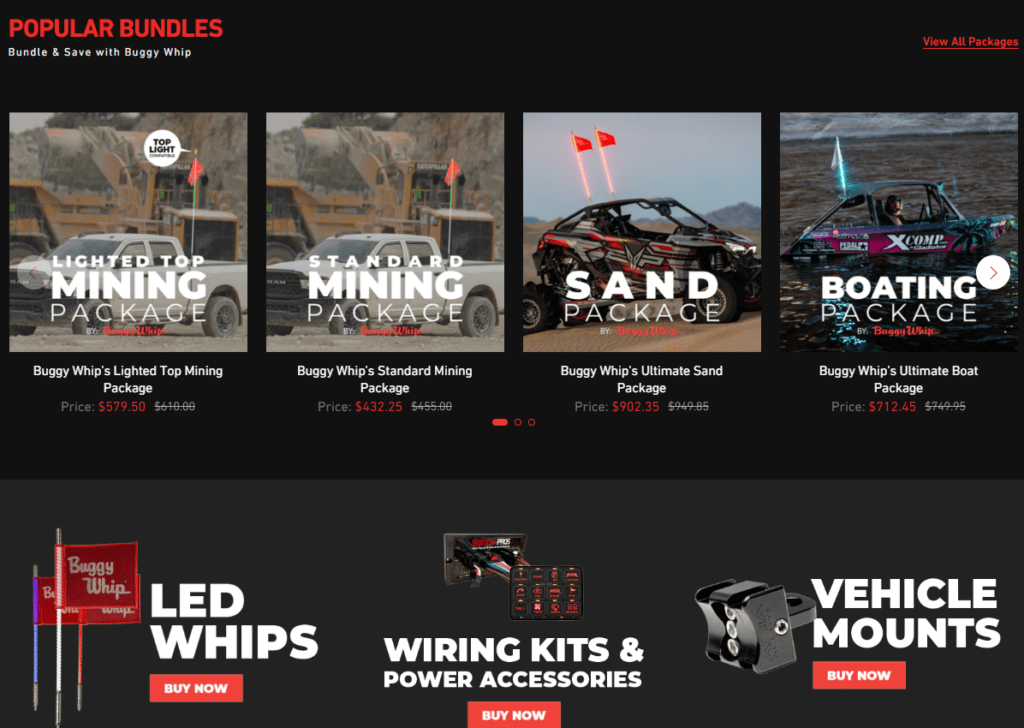
This case study showed how the right improvements can change the trajectory of cart conversion rate — from 0.3% to 1.9%. Things that have huge impact does not always require heavy-lifting. Looking for opportunities to make improvements can be found in the tiniest changes.
The Research
BuggyWhip.com is a leading manufacturer and brand for LED safety whips. They wanted to increase sales through their eCommerce site. They sell products to customers in the mining industry, off-road racing, pickup trucks, and more.
The majority of customers who visit the BuggyWhip website express a high level of intent to purchase, given the specificity of the product.
Consequently, they expect a seamless and effortless checkout experience. As a Shopify Plus storefront, BuggyWhip has access to exclusive features that optimize the checkout process from the product page to the final checkout.
However, the BuggyWhip team has not fully capitalized on some of these features, which may impact the overall checkout experience for the customer. As such, it was recommended by FMDM that we explore the full range of features available to them to ensure that the checkout process is as smooth and efficient as possible.
The Execution
One of the changes included upgrading Shopify to one-page checkout. While this seem like a small change, it changed the way shoppers shop with BuggyWhip.com.
We implemented significant enhancements to the customer journey, aimed at streamlining the process and expediting users to the checkout stage. Foremost among these improvements is the addition of dynamic checkout buttons on the product pages, which affords customers the convenience of one-click purchasing, using their preferred payment method of choice (ShopPay, Google Pay, Apple Pay, etc.).
In addition, the checkout experience is now branded per BuggyWhip’s visual guidelines, which serves to bolster brand trust. The entire checkout process has been revamped to a single page, resulting in fewer clicks required to finalize the purchase. Furthermore, we have optimized this layout to be compatible with both desktop and mobile devices, thereby enhancing the user experience and convenience.
We continue to push the limits of the checkout experience, we know there’s more opportunities.
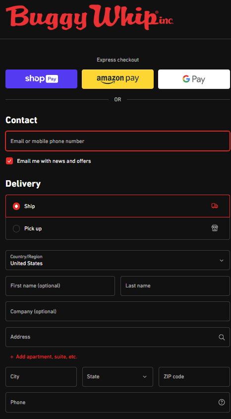
We saw a +343% increase in the conversation rate in less than 30 days that translated into +16% in store revenue.
CRO Actionable advice
It all comes down to really knowing and understanding your target audience and how they like to shop.
It doesn’t matter what you think, results matter.
The cart has one function. To get people to make a purchase. By streamlining the process, you remove roadblocks and resistance. Don’t drive your customers away by adding unnecessary distractions.
It is imperative that you utilize your selling platform to its fullest extent without hesitation.
It is essential that you stay informed of any changes occurring within your platform to avoid missing out on new features that can significantly impact your business.
Lastly, be reminded that time is of the essence, and providing customers with a seamless, quick, and efficient experience will lead to higher conversion rates, and ultimately, increased customer satisfaction.
Want to know more?
Keep learning how we can help.
Ready to solve challenges?
Yes, let’s have a conversation!


