

For starters, Google has completely moved to an entirely new and forward-thinking way of indexing websites everywhere.
Starting July 1, 2019, all new sites will be indexed using Google’s mobile-first indexing. That’s a HUGE deal! Since majority of websites are still not even close to being mobile-friendly.
Search Engine Land has a summary of what Google’s mobile first indexing mean to new and old websites.
With the increased use of mobile devices across the globe, marketing campaigns need to rush into adapting their websites for delivery.
Your eCommerce website might have been designed exquisitely for the desktop user, and have proven exceedingly useful to reach out to consumers and generate online sales.
However, the change in format from search, discovery and transaction on a desktop to a mobile screen has already negatively influenced shoppers’ experience.
Even though mobile adoption is still in its infancy, it is imperative to move from the desktop experience quickly.
The solution is to adapt your website to the mobile experience and make mobile-first a company-wide initiative.
To help, we’ll take a look at how a company can set about changing its eCommerce strategy to suit mobile devices better.
How To Make Your eCommerce Website More Mobile-Friendly: 11 Actionable Tips
1. Think Mobile-First (For the foreseeable future)
Create website designs that are exclusively for mobile. On mobile devices especially, a user’s first instinct is to scroll.
With that in mind your eCommerce website’s UI and UX play a exponentially pivotal role in meeting and exceeding your site visitor’s expectations.
This opens up the opportunity for brands to design an immersive mobile experience, that easily guides a user through the content, products, and messaging.
2. Make It Local And Personal
Take advantage of the user’s mobile location to deliver the most relevant, timely, and curated experience. This can include personalized, local information when your visitor is browsing your website.
There are so many APIs these days, there’s an abundance of connectivity and portability of apps and software to bring localization and personalization to the forefront of your mobile experience.
For example, you can programmatically integrate things like local weather, proximity data, demographic, browsing behavior and so much more.
Your customers will be more likely to interact with content that is locally relevant and personally curated, while highlighting your brand, products, and services.
Mobile provides the opportunity to provide this additional layer of personalization anytime, anywhere, to everyone.
3. Use A Simple Design And Bright Images
Simple design will always win with mobile eCommerce websites.
Over 80% of email campaigns are opened on a mobile device. And a staggering percentage are on social media.
Yet so many websites continue to focus on the desktop designs.
You need a complete 180-degree mindset reversal. Reverse your way of thinking. Stop with the “It’s always been this way,” or “We don’t have resources,” or whatever excuses.
There’s no more time for excuses to not think mobile first.
I’m not a designer by any stretch of the imagination, but mobile sites that do well often have these traits in common:
- use a bold fonts
- single column design
- larger bright images to capture more attention
- streamlined navigation
- fast loading
4. Test On iOS and Android
Be sure your mobile website layout render correctly on mobile devices — iPhones, Androids, even Windows.
A mobile-first mindset means that you must, unequivocally, deliver the same amazing experience to anyone who visits your website.
Device compatibility can make hurt your traffic and sales. For example, if you’re selling high-end furniture, and decided that the 0.8% of Windows mobile device uses can be ignored — you could shoot yourself in the foot.
Why? What if that small percentage of population happen to have the highest lifetime value? Is it guaranteed? No. Is it possible, very!
We are living in a world of digital transformation where we cannot afford to ignore or be ignorant about who our customers are or might be.
Include a “tappable” call-to-action button on every meaningful touch point. Don’t leave anything to chance.
The one sentence I hear often is “The customer should be able to figure it out.” No they won’t!
5. Timing is Everything
Yes, and it’s now! If you have no plans to evolve and adapt to the growing mobile growth, you will get left behind.
We have talked to prospects from both sides of the spectrum. Most thing it can wait, while a few are going all-in into mobile first.
Guess who will come out ahead?
To completely overhaul your website and transition to mobile-first can be painful for many businesses. Especially ones that were built on legacy eCommerce platforms.
Of course, if you’re on Shopify, BigCommerce, Miva, WooCommerce or some other more cutting edge eCommerce platform (or software), chances are you’ll more prepared.
Nonetheless, the entire organization is required to buy into the fact that everything each department does must be mobile first.
6. Focus On a Single-Column Design
Two-column or even three-column eCommerce websites might look great on a wider desktop format, but they can easily become cluttered and confusing when viewed on a smaller mobile screen.
The single-column approach can significantly change how design teams approach projects.
When talking to web designers, it is rare that you review it on your mobile device — looking at the mock ups on a 30-inch or wider desktop screen is just so much easier. But that’s also what takes you and your team away from being mobile first.
Mobile device formats are longer than they are wide, so follow this same format with a single-column design and you’ll be on your way to adopting a mobile-first mindset.
Pairing down your content to one column will result in:
- clean layout
- simplistic design
- seamless experience across mobile devices
- streamline maintenance
- portability
- and much more
7. Think End-To-End User Experience
Mobile-optimized design and relevant content all shape how a user engages with your eCommerce website.
At the end of the day, your goal is to get your visitor from homepage to checkout (assuming they find what they’re looking for) with extreme and unprecedented ease.
The navigation, discovery, and search capabilities of your website should be of utmost priority for mobile devices.
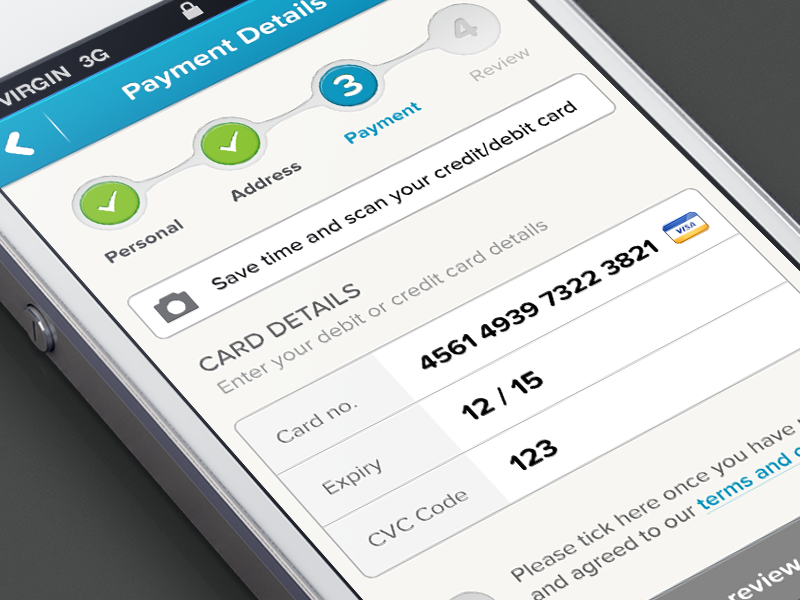
Let’s take for example one simple interface — credit card payment information entry. The customer has already decided to buy from you. Are you making it easier for them to complete the transaction, or is your interface clunky and cause frustration?
Think through the entire user experience to ensure it is optimized for mobile start to finish.
Storyboard the steps to make sure you leave no stones unturned. Let me stress this…and over stress this. Gone are the days of having the luxury to not creating an excellent (not perfect) customer experience.
8. Keep Your Mobile Content Short And Actionable
Be different. Stand out. You hear people say that all the time.
Throw that out the window. Instead, be relevant and engaging.
Focus on what your customers expect. They may or may not know what they want. It is your responsibility (you owe it to your customers) to create a WOW! mobile experience.
User attention span is diminishing with every new app launched.
When it comes to mobile-first websites, the key to success is to keep your design clean, content short, engaging and actionable.


