How many times have you heard that a picture is worth a thousand words? With all the messages that a singular image can convey, the importance of knowing what you’re communicating is a given. But are you aware of what and who is missing in the images and how you put them forward? Pioneering accessible image creation and presentation can have a happy effect for your brand.
In this article:
- Accessible Imagery Leads to Company and Societal Gains
- Stats: Access for Diverse Demographics
- Stats: Access for Diverse Abilities
- Tricks to Keep Tone: Considerations for Content/Image Creation
- Transitioning to Accessible Imagery
- Additional Toolkits, Examples, and Resources
Accessible Imagery Leads to Company and Societal Gains
You can have the perfect image that is the crème de la crème (cue chef kiss). But if it is missing contrast, alt text, or vivacious representation of all walks of life, you could be losing out on diverse clientele such as: blind and visually impaired individuals, neurodiverse folks who benefit from screen-readers, physically disabled or limited individuals, POC, LGBTQA+, and older adults. When businesses represent these and other demographics in their image advertising, profits and consumer rapport increase. Similarly, making accessible content opens the door for a multitude of additional markets and puts you ahead.
BACK TO TOP
The Stats Speak for Themselves
Access for Diverse Demographics
To help track the effect of changes made in advertising, SeeHer developed the Gender Equality Measure (GEM®) in 2016. This research methodology quantifies gender bias in ads and programming profit margins report (page 42) short and long term impact: high GEM®-scoring ads increase sales by 5x, as well as have a notable influence on customer choice intent and brand reputation and relationship.
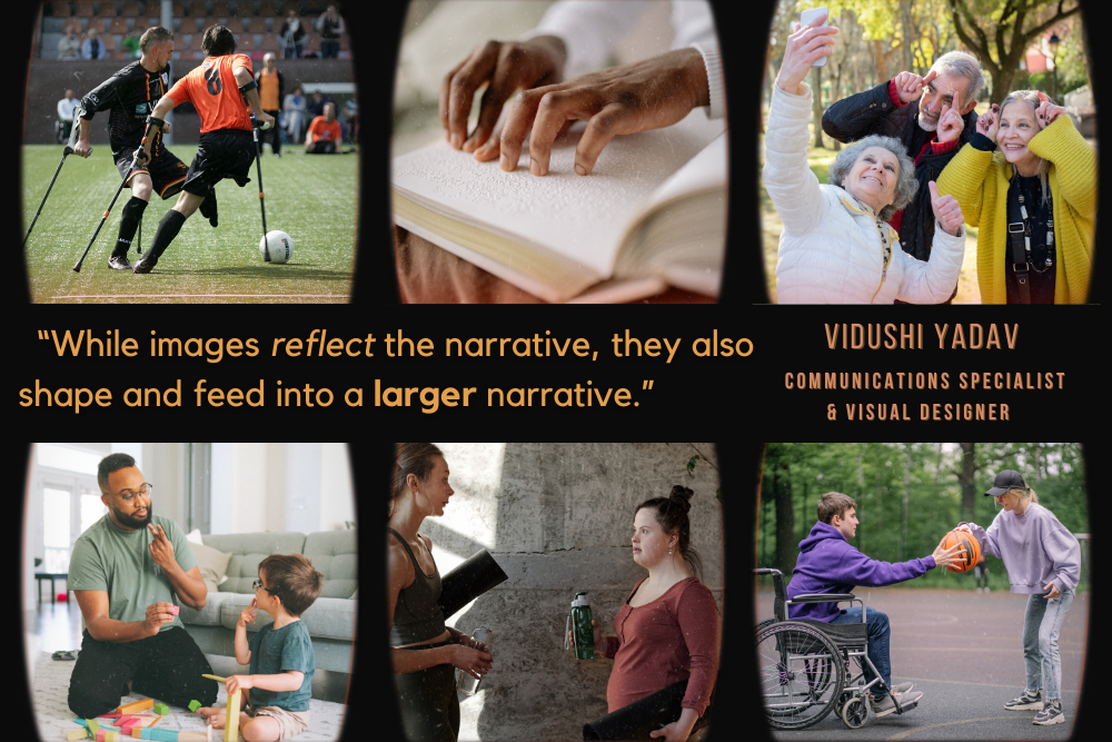
The good stuff doesn’t stop there. Although gender is the title issue, SeeHer has a broader reach and focus. In fact, the company teamed up with Getty Images to create a big-picture guide for equality and equity in image creation that goes beyond advocating for female representation in ads and also addresses race, ethnicity, age, disability, body, and, if you’ll pardon the pun, more gems.
One successful example that we can look to is AerieREAL, a campaign that opened up to everyday women of all lifestyles and abilities and disavowed supermodel culture. As seen on Forbes, this strategy was wildly triumphant and the company is expecting to continue to see their profits double by 2023. In contrast, previous lingerie giant Victoria’s Secret has stuck with their traditional advertising methods and seen a sharp decline in their sales.
Access for Diverse Abilities
When it comes to image readability, becoming well-versed in the type of visual barriers will demystify the simple pivots you can make to better serve existing and potential stakeholders. Types of visual impairment include color blindness, full blindness, tunnel vision, loss of acuity (blurred vision), and more.

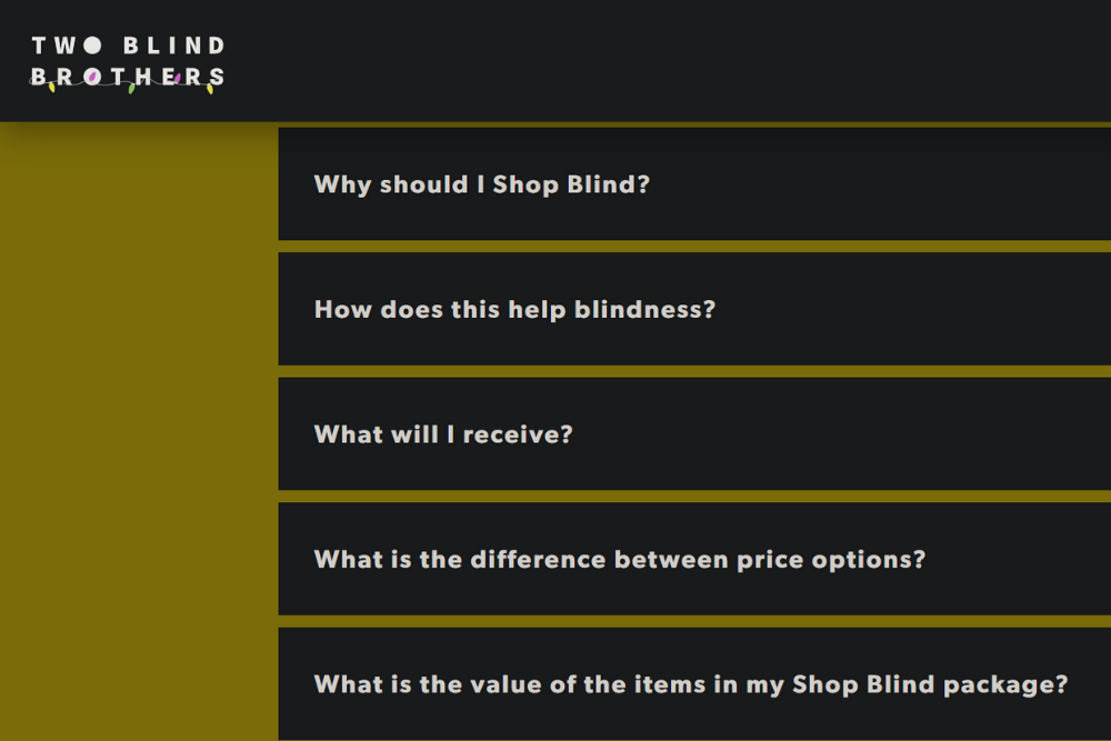
An example of what this can look like can be seen above: the image is a snapshot from Two Blind Brothers, a family-run online retailer created and run by a couple of blind siblings. The high contrast and chique simplicity is website accessibility at it’s finest.
BACK TO TOP
Tricks to Keep Tone
Considerations for Content/Image Creation
You don’t have to sacrifice your brand or tone to make adjustments, the right simple changes go a long way! Webdesign’s Best Practices expand on how you can make tweaks that don’t detract from your brand, such as:
- Separating content and structure.
- Providing effective alternate text (Or, alt text: text descriptions of images on web pages that are read aloud by screen-readers).
- Avoiding using color only to convey information (such as an incorrectly filled field).
- Relying on textures as well as colors.
- Utilizing monochromatic color schemes.
- Using high-contrasting colors for better readability.
Additional Tips from the Den
- Be mindful of font choices, line thickness, essential punctuation, and character spacing. Fancy can be fun, but can it be read?
- KISS: Keep It Simple, Silly! Crowded or busy images can be overstimulating.
- Use informative alt text up to 125 characters. Screen-readers tend to cut off extensive alt text indiscriminately.
- Check how your images answer the lists of pertinent accessibility questions posed by Getty Images and SeeHer on their Imagery Toolkit.
BACK TO TOP
Transitioning to Accessible Imagery
Stay curious as you navigate unfamiliar DEIB territory where you have limited direct personal experience, and encourage patience with your teams. Learning all the ins and outs of new strategies can take time to establish new procedures and mindsets. Important keys to limitless knowledge are humility, seeking out expertise, and challenging out-of-date systems. By starting small and leaning into informative toolkits from vetted authorities for guidance, you can build accessible content that radiates your vibe as soon as today!
BACK TO TOP
Additional Toolkits, Examples, and Resources
- Web Accessibility Initiative Images Tutorial: Text alternatives based on image purpose (Informative, Decorative, Functional, Text, Complex, Image Groups, Image Maps).
- Google Material Design Accessibility Guidelines: Design hub.
- ColorSafe.co: Accessible color palettes.
Tune in next week for the latest news in digital marketing from the Wolves’ Den.


